Tiny Tips: Into Darkness
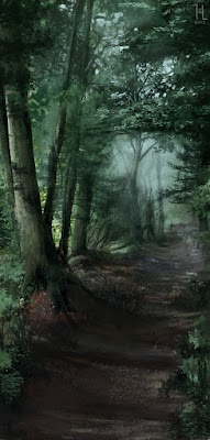
While the title is an obvious quote to the second Star Trek film, the tutorial deals not with spaceships and macguffins, but the issue of shadows in the basic sense. I found them hard to understand in the beginning; I used always the same lighting, never the right colours, and terrible edges. Shadows are the flipside of the lighting scheme of the painting and must be treated carefully. Mostly, they are more saturated than one would think. They are also not objective, but seem "more right" when they are of slightly contemplary colour (e.g. purplish, or cool shadows for warm skin).
There's also much more going on in the shadows than one thinks - it's not a flat plane of darker colour. Adding a new lightsource to make sure ths shadows aren't pitch black opens another stage to fill.
One more trick I've learned: the terminator (the line where shadows turns into light) looks nicely with a line of more saturated colour blending between the two. This has done wonders for my portraits lately, especially in harsh lighting conditions that provoke strong shine of the skin, to also add subsurface scattering, that always makes skin look more lively.
 |
| Large file on deviantArt |


Comments
Post a Comment